

Roy, like this? (Small caps, had to make the T and W non-bold in order to have roughly the same stroke width).
![]()
IMO letters/font have to be bolder. Like this they're kind of unreadable in phones and tablets.

i like the art-deco idea very much.
dewster, which font did you use?
there are tons of (free)fonts to use. the one i used is called "reynold art deco" and is widely availlable. i have to admit, it's more art nouveau.with whatever font it will end: the distance between the individual letters is quite important, so that a word looks harmonic to the eye. i think it's called "kerning". for example the distance between dewster's W&O and O&R have to bee slighty corrected and so forth. it's about dark and light, so while checking for harmony squinch the eyes a bit so it gets more blurry, that helps very much. trouble: since L&D have the biggest distance, one could end in a ligature of the letters. my dad was a old school typesetter,they shifted letters with that thin japanese paper and myself had to paint letters from capitalis monumentalis to humanistic majuscule professionaly.
i smoothed the logo a bit too.: 
mpampouras, yes the the font should be bolder, the one I used is the first deco-like font I encountered in the alphabetized Word font list, named "B733-Deco" and it is quite thin.
Ooh, xtheremin8, I like what you did! Particularly the shaping of the antenna to match the font stroke. I agree with your kerning observations, I was just tossing stuff together.
This one uses a font called "Lemondrop":
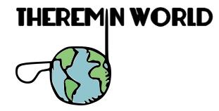
I think the 'i' pitch rod gets lost as the pitch rod, thus what it is all about (the instrument) as well gets lost in its singular perception. While the tall 'i' hurts the visual flow of the word..
Art deco works very well though.
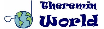
Funny, before your vectorization i never stumbled across the logo being that pixelated.
glad dewster knows kerning! it's a bit like tuning the eye. instead of the ears. anybody for haidingersche büschel?
vectorgraphics are so new to me. but to separate the logo from the fonts you have to do something. the graphic was depixeled with inkscape, not entirely by mistake, but almost. ohdear.
first, i like the clearness of this website, and also the jungle side of it. a bit frustrating are the tw-internal deadlinks to related threads and topics in some older tw-discussions sometimes. but that's maybe as it is. or a verz forensic one. to me it always looked a bit like a classic newspaper style front. cool and clear. great 20 years jason.
yes, the "i" idea eats a bit the antenna. maybe if the antenna radiates "i" dots..like a gif or so. would fit more a radio website, maybe....or if the mouse hoover over, something happens with the logo. like the whole world rotates or vibrates a bit... (i'm just half-conscioussnessly brainstorming away)... but, the fatter fonts look defenitely better and also more like it already is. my association with theremins and style was always that iconic picture of clara in front of tthat diamond speaker..chrysler-building-art deco-a bit futuristic thing. or that skinny mackintosh swing.
i have no problems with the moog-blinky, but i think they could easily change the theremini-ad to something like a overview of their different theremins moog produced in it's history. may the link lead to wherever they like. would be fair, after all.
@dewster in post #11 -yes, that's what I meant.
Having said that, xtheremin8's suggestion in #13 is really nice.
As Dominik points out though, the pitch rod is in danger of getting lost as a discrete pitch rod in the design, maybe because the outline of the icon pic has gone from blue to black?
Jason, do you have a higher resolution version of the current logo?
Thinking out loud: I wonder if the word "World" in the logo could be removed, and be implied by the earth / Theremin below? Kinda like this:
![]()
I like the way the M and N of this font point up to and frame the antenna tip. Centering is off here due to the gauntlet of highly questionable steps employed (Word, Adobe PDF, TIFF, Paintshop), each of which have their way with the content .
Ahh, I'm probably out of ideas here.
The original vectorized (just for my training)
![]()
something more of the spooky kind (font is 'Jolly Lodger')
![]()
and then nearly horror..
![]()
.. calming down (font is 'DIN')
![]()
The good old 'Futura'
![]()
and once again but more orientated on the original logo
![]()
Last one seems nice. Vectorizing works well especially if the .svg file is used directly online.
You can zoom as much as you want and there is no pixelization!
You must be logged in to post a reply. Please log in or register for a new account.


