"I like the new design but I gave it for granted that the black parts were metal, so is it all plastic even in the structural support points?" - Spider76
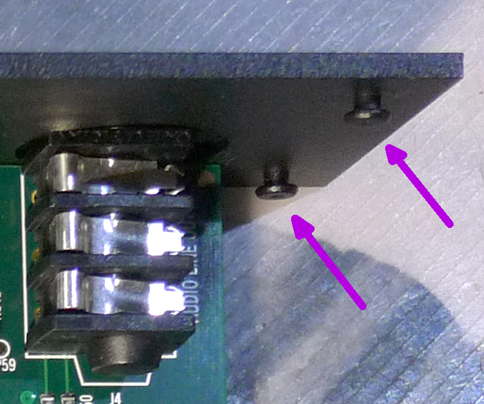
The front control panel and back I/O panel are made of metal. The back panel has little shoulder screws at the corners...:

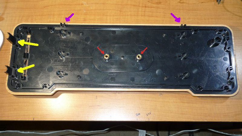
... that fit into plastic slots in the top and bottom (purple arrows):

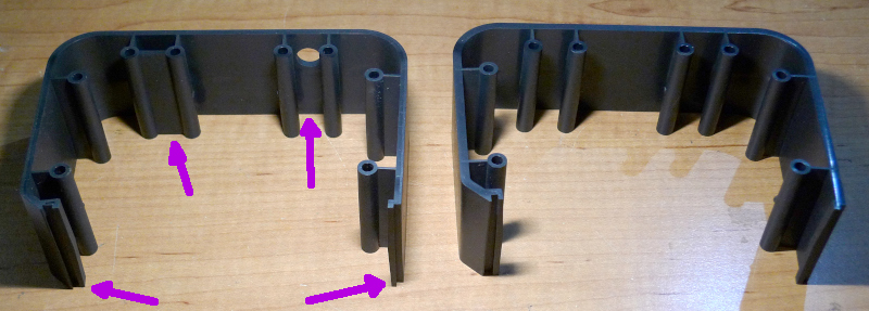
The front panel has no shoulder screws, it is held in place mainly by the PWB and some slots in the plastic side pieces (left arrow):

The plastic end pieces are just sandwiched between the top and bottom with no fasteners, though there are retaining pins and ribs and such molded into the top and bottom.
"And the wobbliness of the antennas...just wow."
Yes. I should add that there are internal guides for the volume loop molded into the top and bottom (yellow arrows in second photo above) but they only reinforce the outer pivot points. The inner support for the long end of the volume loop is just the hole the volume coil PWB, which has slots it fits into, but is otherwise rather loose. The short end of the loop has no support that I saw, and just butts up against plastic (upper left arrow in last photo). This is aggravated by the sheer mass of the solid metal rod used for the volume loop (3/4 lb!).
"I was expecting surface-mount components and a general "modernization" of the instrument, but with the objective of making it better or at least equivalent to the old model, not worse... especially at the price they're asking."
That was my hope as well. My cursory inventory of what's in there shows an updated power supply, explicit decoupling for the pitch oscillators, and mute input, but that's about it. The reduction in pitch coils from 3 to 1 seems like it could influence the pitch field, likely in a negative way?
I didn't mention that the power and mute indicators on the front panel are actually plastic light pipes, which are illuminated via surface mount LEDs on the main PWB. Significant light from the power LED leaks into the mute indicator, leading to a somewhat ambiguous mute condition display (it looks sorta muted when it's not). IMO the mute state is a big deal in a performance situation, and so should be clearly displayed to the player. A lighted pushbutton might work better here.
Also, there are two mute state holders, the front (locking) pushbutton and the back 1/2" input, and both are masters. I believe the way it works is if one or both are calling for mute then it is muted. So you can't unmute it from the front panel if the (locking) footswitch is muting it. This arrangement is probably OK with most players though, and I guess it's safer in some scenarios than momentary controls and a single internal logic state keeper.
"I think my EW+ doesn't need to worry about being replaced anytime soon..."
Hold onto that sucker! ;-)


